 Code 4 Ever (Learn to Code)
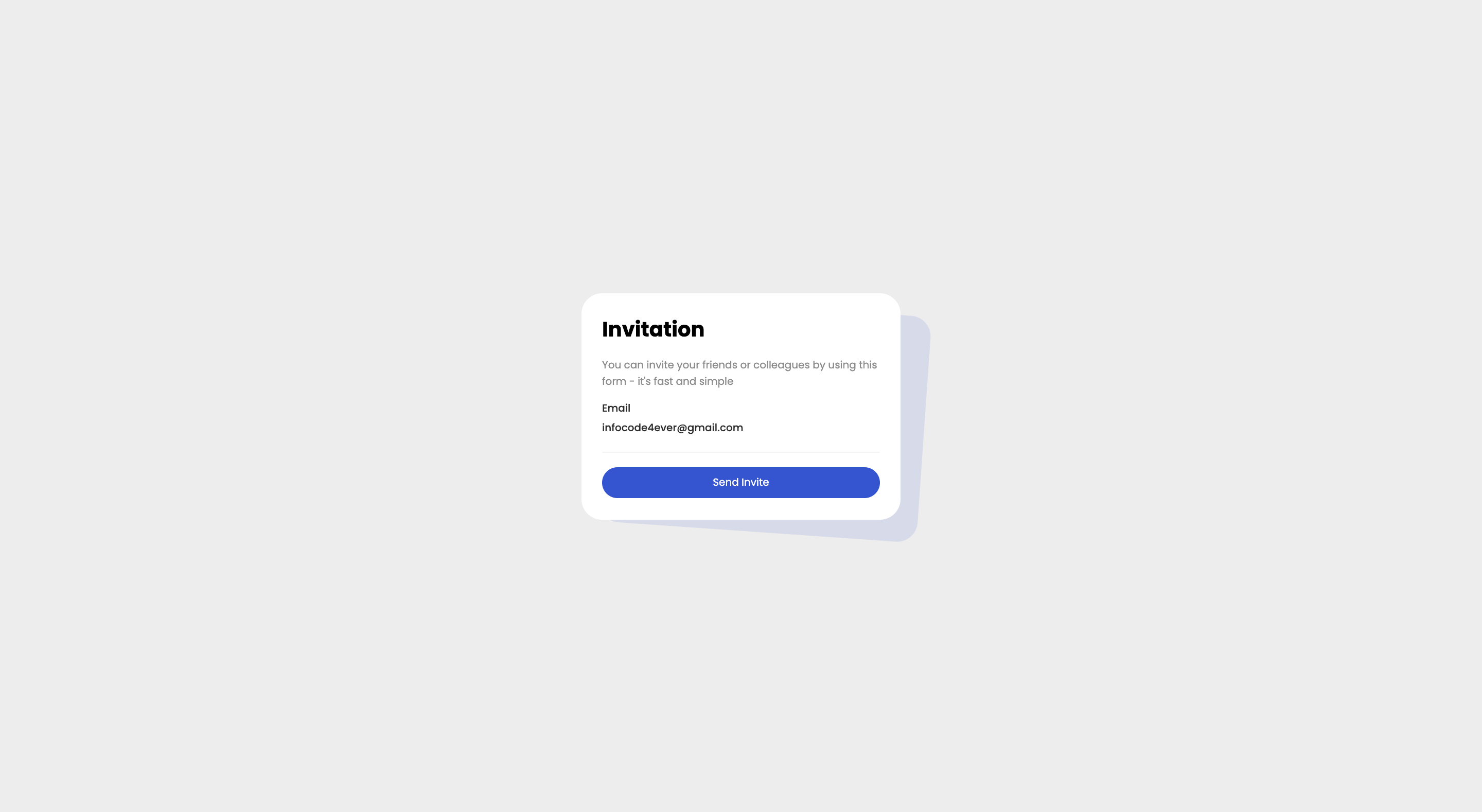
In this article, I will show you how to create invitation card using HTML and CSS.
# Step 1
<!--  Card 1 -->
<div class="card1">
  <!-- Card title -->
  <h2>Invitation</h2>
  <!-- Card description -->
  <p class="info">
    You can invite your friends or colleagues by using this form - it's fast and
    simple
  </p>
  <!-- Email -->
  <div class="email">
    <p>Email</p>
    <p>infocode4ever@gmail.com</p>
  </div>
  <!-- Divider -->
  <div class="divider"></div>
  <button>Send Invite</button>
</div>
<!-- Card 2 -->
<div class="card2"></div>
# Step 2
/* Load google font */
@import url('https://fonts.googleapis.com/css2?family=Poppins:wght@100;200;300;400;500;600;700;800;900&display=swap');

/* Define variable in root */
:root {
  --border-radius: 20px;
  --color1: #3454d1;
  --color2: #8c8c8c;
  --color3: #2d2d2d;
  --color4: #f5f5f5;
  --color5: #1f243d;
  --color6: #ededed;
  --white: #fff;
}

/* Apply Poppins font to all elements */
* {
  box-sizing: border-box;
  padding: 0;
  margin: 0;
  font-family: 'Poppins', sans-serif;
}

/*  Center body content */
body {
  display: flex;
  justify-content: center;
  align-items: center;
  min-height: 100vh;
  background-color: var(--color6);
}

/*  Style first card */
.card1 {
  width: 310px;
  height: 220px;
  background-color: var(--white);
  position: absolute;
  z-index: 99;
  border-radius: var(--border-radius);
  padding: 20px;
}

/*  Style card title */
.card1 h2 {
  margin-bottom: 12px;
  font-size: 20px;
}

/* Style card description */
.card1 .info {
  font-size: 10px;
  color: var(--color2);
}

/*  Card button */
.card1 button {
  width: 100%;
  height: 30px;
  background-color: var(--color1);
  border: none;
  border-radius: var(--border-radius);
  color: var(--white);
  font-size: 10px;
  font-weight: 400;
  cursor: pointer;
}
/*  Email container */
.email {
  margin: 8px 0;
}

/* Style email paragraph tags */
.email p {
  font-size: 10px;
  color: var(--color3);
  font-weight: 500;
  line-height: 1.2rem;
}

/* Style the line  */
.divider {
  border-bottom: 1px solid var(--color4);
  margin: 14px 0;
}

/* Style the card 2  */
.card2 {
  width: 310px;
  height: 220px;
  background-color: var(--color5);
  position: absolute;
  border-radius: var(--border-radius);
  /*  transform card to 4 deg and translate 16px in x */
  transform: rotate(4deg) translateX(16px);
  transform-origin: bottom left;
}
Share with