 Code 4 Ever (Learn to Code)
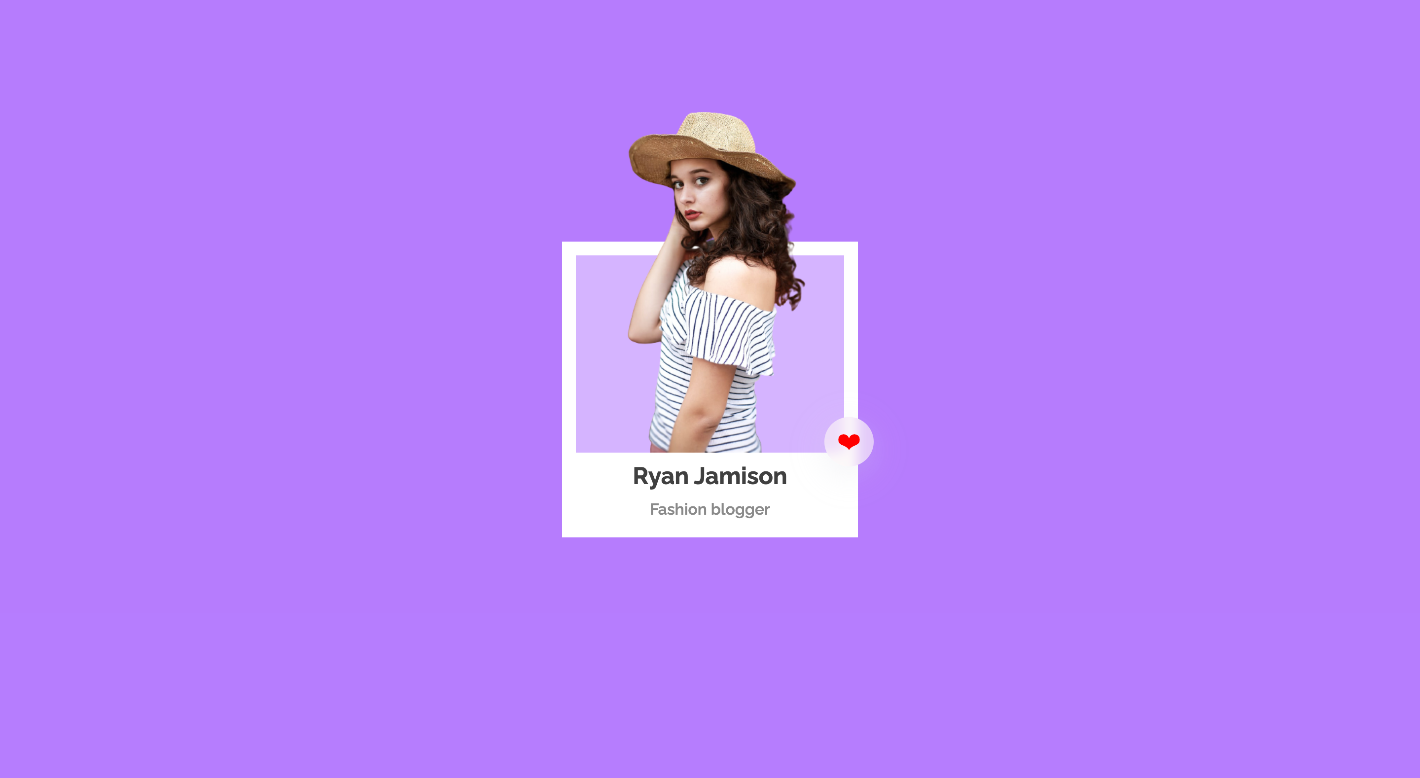
In this article, I will show you how to create card using HTML and CSS.
# Step 1
<!-- card 1 -->
<div class="card">
<!-- card 2 -->
<div class="inner-card">
<!-- image -->
<img src="./image.png" alt="Card Image" />
<!-- circle with heart emoji -->
<div class="circle">❤</div>
</div>
<!-- card title and subtitle -->
<div class="card-content">
<h2>Ryan Jamison</h2>
<p>Fashion blogger</p>
</div>
</div>
# Step 2
/* load google font */
@import url('https://fonts.googleapis.com/css2?family=Raleway:wght@100;200;300;400;500;600;700;800;900&display=swap');

/* Apply google font to all elements */
* {
  box-sizing: border-box;
  padding: 0;
  margin: 0;
  font-family: 'Raleway', sans-serif;
}

/*  Center body content */
body {
  display: flex;
  justify-content: center;
  align-items: center;
  min-height: 100vh;
  background-color: #2d2d2d;
}

/* Create a card (card 1) */
.card {
  width: 300px;
  height: 300px;
  background-color: #fff;
  display: flex;
  flex-direction: column;
  align-items: center;
  position: relative;
  padding: 14px;
}

/* Create a inner card (card 2) */
.inner-card {
  width: 100%;
  height: 200px;
  background-color: #d5b4ff;
  position: relative;
}
/*  Position absolute to image inside inner card */
.inner-card img {
  position: absolute;
  width: 100%;
  bottom: 0;
}

/* Circle with heart emoji */
.circle {
  width: 50px;
  height: 50px;
  position: absolute;
  right: -30px;
  bottom: -14px;
  background: rgb(251 246 246 / 64%);
  box-shadow: 0 8px 32px 0 rgb(208 209 223 / 27%);
  backdrop-filter: blur(6px);
  border-radius: 100%;
  display: flex;
  justify-content: center;
  align-items: center;
  font-size: 25px;
  color: #ff0000;
}

/* Card title */
.card-content h2 {
  line-height: 3rem;
  color: #404040;
  text-align: center;
}

/* Card subtitle */
.card-content p {
  color: #8a8a8a;
  font-weight: 600;
  text-align: center;
}
Share with