 Code 4 Ever (Learn to Code)
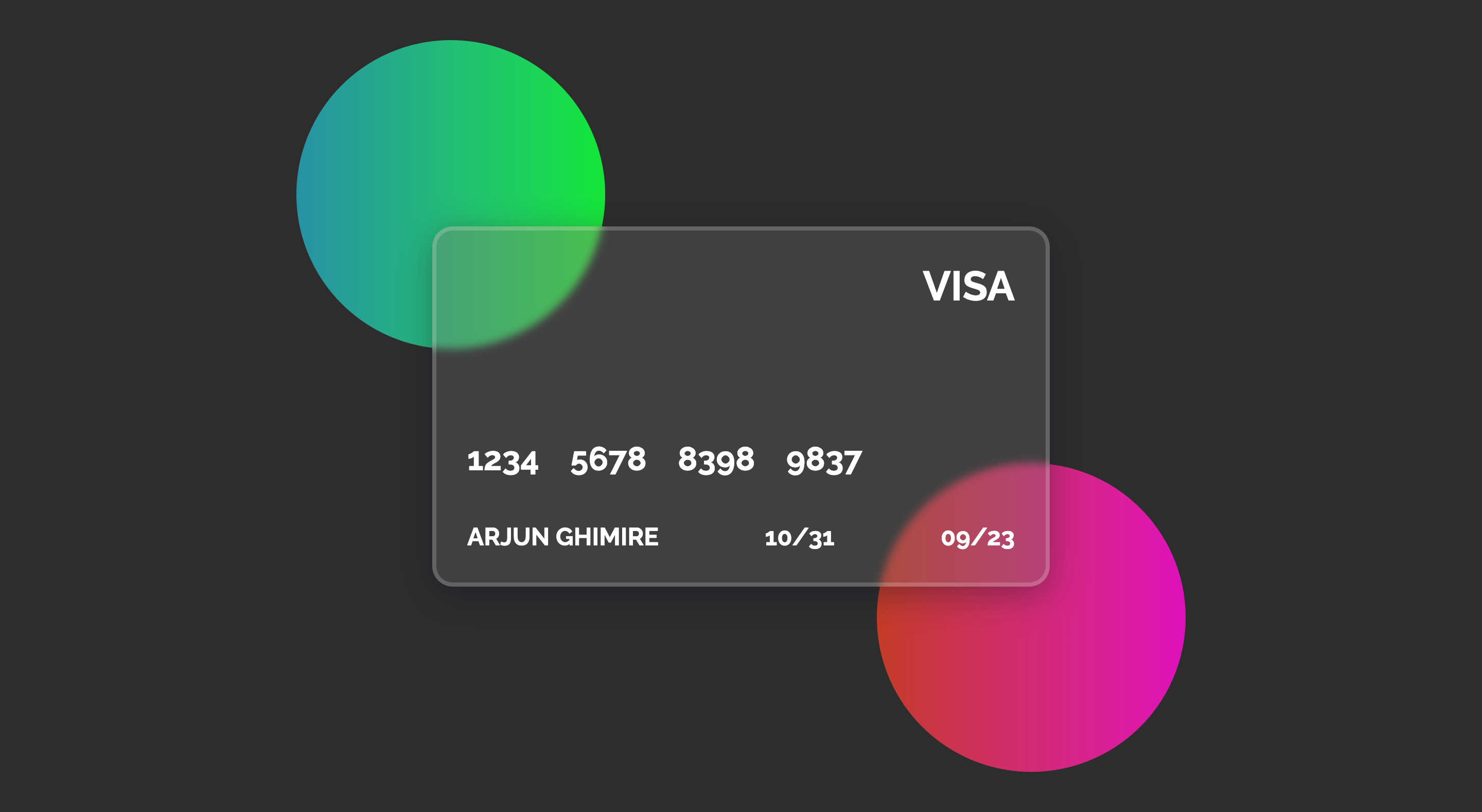
In this article, I will show you how to create a Glassmorphism Visa Card.
# Step 1
<!-- circle 1 -->
<div class="circle1"></div>

<!-- mastercard -->
<div class="mastercard">
  <!-- mastercard header -->
  <div class="mastercard--header">
    <h2>VISA</h2>
  </div>
  <!-- mastercard content -->
  <div class="mastercard--content">
    <h1>
      <span>1234</span>
      <span>5678</span>
      <span>8398</span>
      <span>9837</span>
    </h1>
  </div>
  <!-- mastercard footer -->
  <div class="mastercard--footer">
    <h2>ARJUN GHIMIRE</h2>
    <h2>10/31</h2>
    <h2>09/23</h2>
  </div>
</div>

<!-- circle 2 -->
<div class="circle2"></div>
# Step 2
/* load google font */
@import url('https://fonts.googleapis.com/css2?family=Raleway:wght@100;200;300;400;500;600;700;800;900&display=swap');

/* Apply google font to all elements */
* {
  box-sizing: border-box;
  padding: 0;
  margin: 0;
  font-family: 'Raleway', sans-serif;
}

/*  Center body content */
body {
  display: flex;
  justify-content: center;
  align-items: center;
  min-height: 100vh;
  background-color: #2d2d2d;
}

/*  Style for mastercard */
.mastercard {
  width: 600px;
  height: 350px;
  /* Starting of glassmorphism style */
  background: rgb(108 108 108 / 30%);
  box-shadow: 0 8px 32px 0 rgb(16 17 30 / 37%);
  backdrop-filter: blur(4px);
  -webkit-backdrop-filter: blur(4px);
  border-radius: 20px;
  border: 4px solid rgba(255, 255, 255, 0.18);
  /* End of glassmorphism style*/
  z-index: 9;
  padding: 30px;
  display: flex;
  justify-content: space-between;
  flex-direction: column;
}

/* Style mastercard header */
.mastercard--header {
  flex: 0.6;
}
.mastercard--header h2 {
  font-size: 2.5rem;
  color: #fff;
  text-align: right;
}

/* Style mastercard content */
.mastercard--content h1 {
  color: #fff;
}
.mastercard--content h1 span {
  margin-right: 30px;
}

/* Style mastercard footer */
.mastercard--footer {
  display: flex;
  flex-direction: row;
  justify-content: space-between;
  color: #fff;
}

/* Style the first circle */
.circle1 {
  height: 300px;
  width: 300px;
  border-radius: 100%;
  background: linear-gradient(
    to right,
    rgb(18 183 209 / 73%) 0%,
    rgb(4 241 55 / 95%) 100%
  );
  position: absolute;
  top: 5%;
  left: 20%;
  z-index: -1;
}

/* Style the second circle */
.circle2 {
  height: 300px;
  width: 300px;
  border-radius: 100%;
  background: linear-gradient(
    to right,
    rgb(223 61 35 / 85%) 0%,
    rgb(241 4 201 / 91%) 100%
  );
  position: absolute;
  bottom: 5%;
  right: 20%;
  z-index: -1;
}
Share with